
Governors Island Website Redesign
Role: UI/UX Designer
Tools: Figma
Duration: 6 weeks
Context
Governors Island is a 172 acre island located in New York City Harbor. Attracting more than 800,000 visitors a year, the island is open to the public all year-round. It is home to 52 historical buildings, 2 former military fortifications, and a public high school. Visitors can enjoy various food vendors, art and cultural events, and recreational activities in an open space and car-free environment. No residents reside on Governors Island, and the island is only accessible by ferries from Brooklyn and Manhattan.
What are the pain points of the current website?
💬 Discover

Lack of visual appeal
Low resolution photographs make the island seem lackluster and not an attractive place to visit. The two fonts used for headings, Forza and Guppy Sans, also have a technical look and feel as some letters like a, g and o, are quite geometric.

Visual hierarchy could be improved
Sections on the home page are in close proximity. Majority of the secondary pages contain walls of text without white space and headings, making it difficult to read.

Poor information architecture
Multiple pages display the same content (ie: Things to Do & Events). The Real Estate, Support, and some links in the About dropdowns are not relevant to people who are visiting the island for leisure.

Insufficient accessibility considerations
When selected, the side navigation has a color contrast of 2:3:1 which does not pass Web Content Accessibility Guidelines levels AA and AAA.
Competitive Analysis
I examined 3 tourism websites and identified elements that I found to be successful. Here is a summary of my findings:
Intriguing headlines such as fun facts about the country are used to grab the attention of the reader
Color blocking is used to divide sections on a landing page
Common navigation drop downs include “Things to Do” and “Destinations”
Natural light photography is accompanied by a brief description and CTA
🔎 Define
Problem Statement
How might we create a captivating landing page experience that provides valuable information and convinces visitors to explore Governors Island?
Solution
💡 Ideate
Sketches


Moodboards & Above the Fold
📓 Usability Testing
Simplifying the Navigation
Original navigation
I interviewed 5 users and asked them to find information on bike rentals on the original Governors Island website.
100% of users felt the dropdown links were repetitive.
“I’m not sure why there’s a dropdown when they all lead to practically the same page anyway.”
40% of users did not know the first link on the dropdowns could be clicked.
100% users felt not all the navigation links were necessary.
“As a first time visitor to Governors Island, I’m not interested in things like real estate or climate solutions.”
“The links under support are more of an afterthought.”
New navigation
Design Revisions
The redesigned navigation provided a more intuitive structure, giving users a clear, comprehensive overview of the island’s offerings. Specific activities and exploration areas each had their own individual pages.
100% of users preferred the new navigation structure.
Low Fidelity Wireframes
⚡ Iterate
Above the Fold
Before
Initial design does not grab viewer’s attention.
After
A water pool texture is added to the header graphic to reinforce the concept of the island as an urban getaway. I changed the style of the navigation bar to something more unique, whilst maintaining its usability.
Destinations
Before
I originally had duo tone images appear full color on hover, but this made the overall web page look washed out.
After
I retained the images in full color and added a layer underneath the text to improve readability.
Featured Events
Before
This section was initially designed as a card carousel. Users could either drag or click the arrows to reveal more destinations.
After
User testing revealed the card carousel was not intuitive and people did not realize there were more than 3 cards. I removed the carousel and featured the most popular destinations.
Final Deliverables
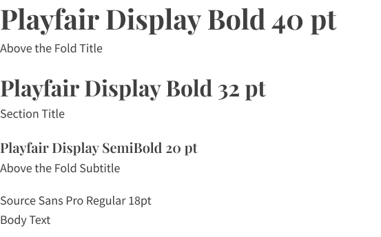
Typography
Color Palette


Hover States

Reflection
Overall, I do like how my redesign turned out but there are areas that could be further improved. My next steps include expanding upon the user flow and creating a separate page for an interactive map.
My takeaways from this project:
Be mindful of time constraints.
Don’t get too attached to first designs in the process.

